Campaign worlds. Brand languages. Visual systems built for the brands that define culture.
24+
Campaigns
11
Awards
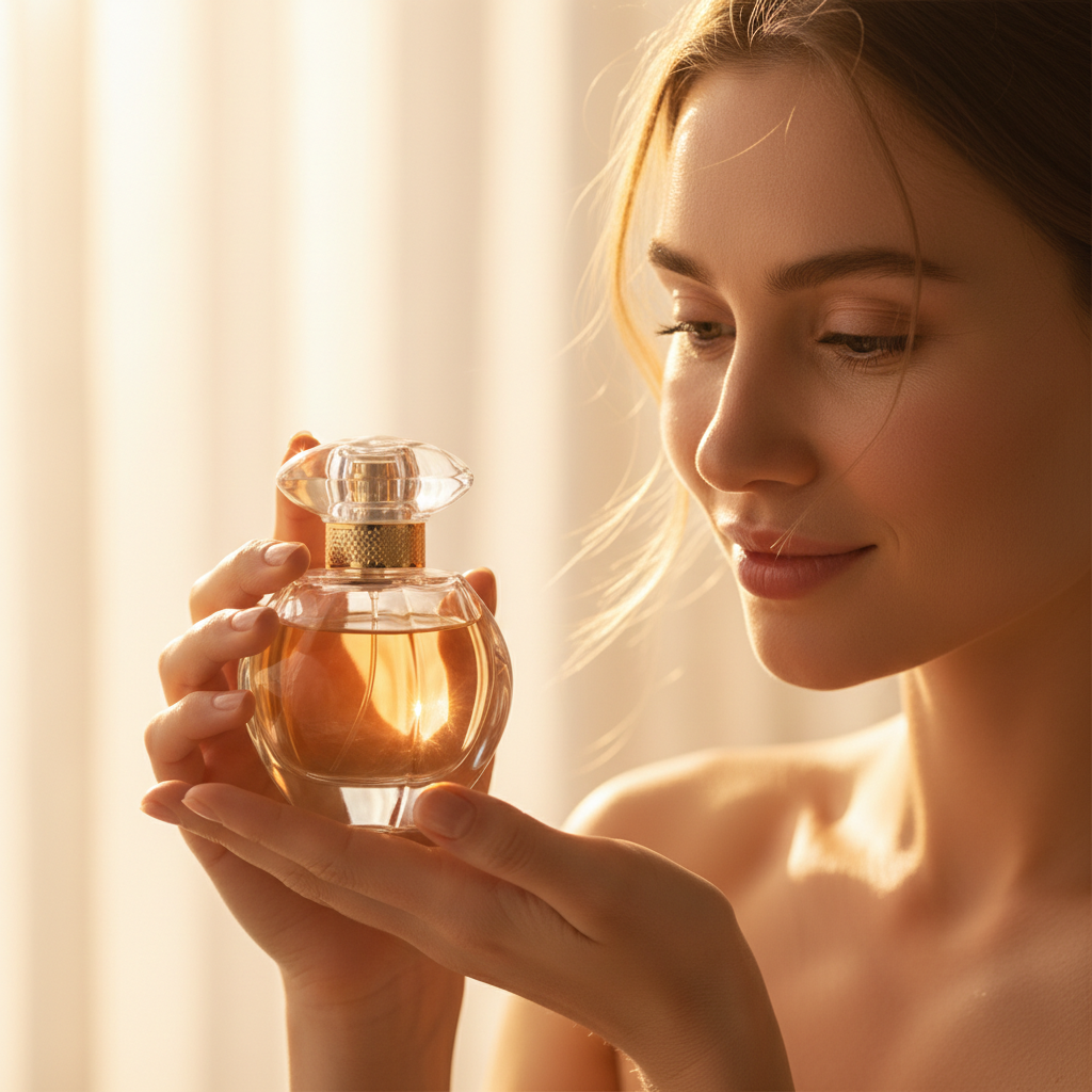
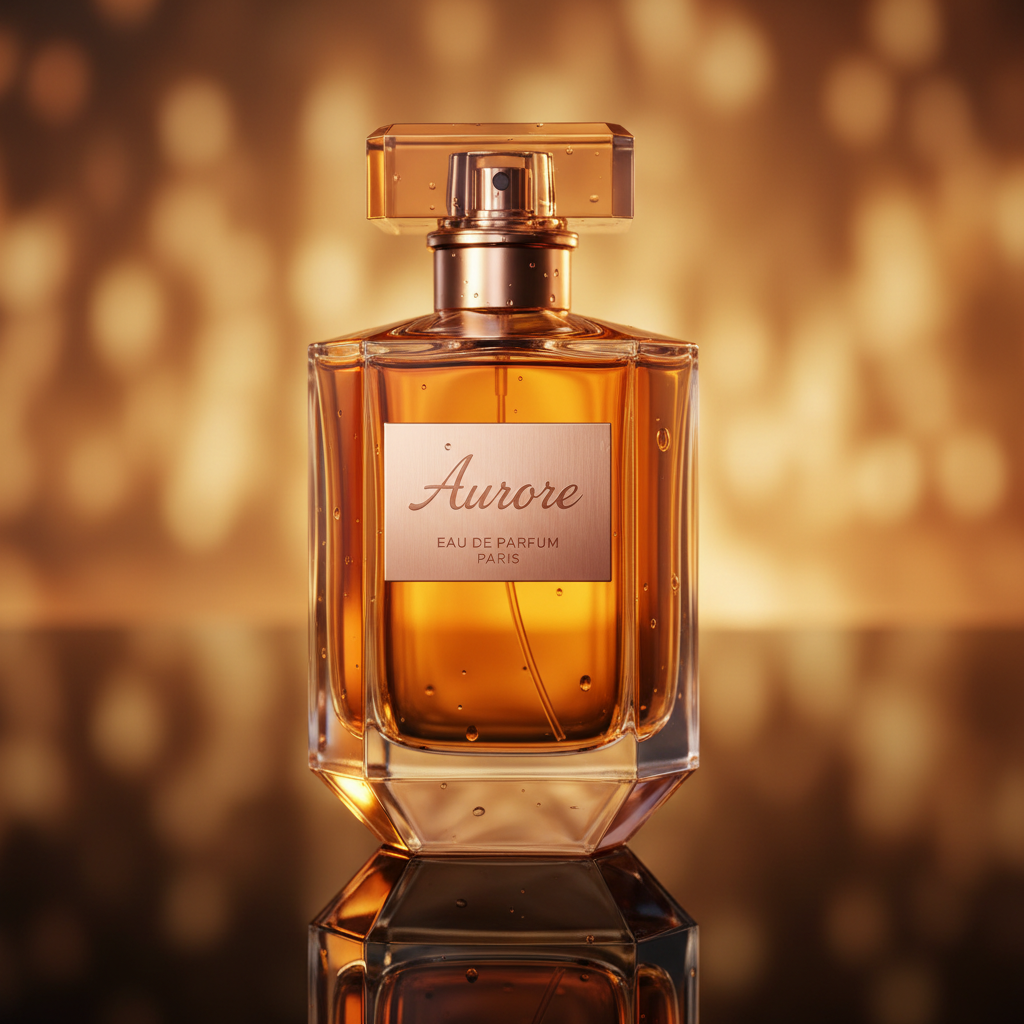
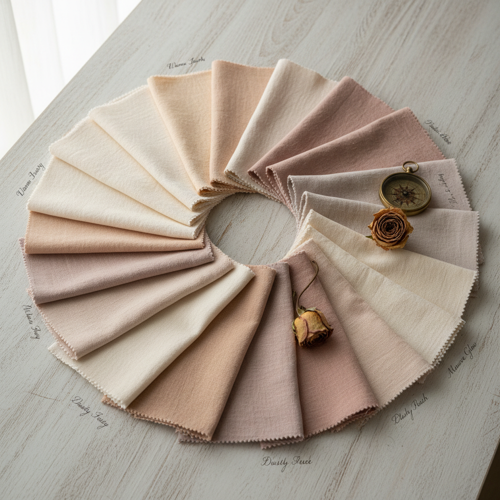
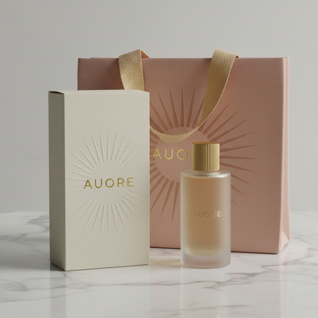
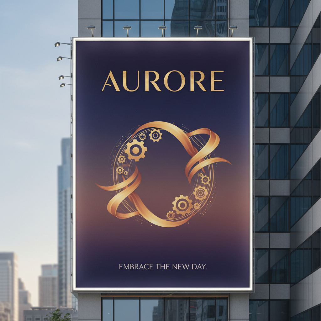
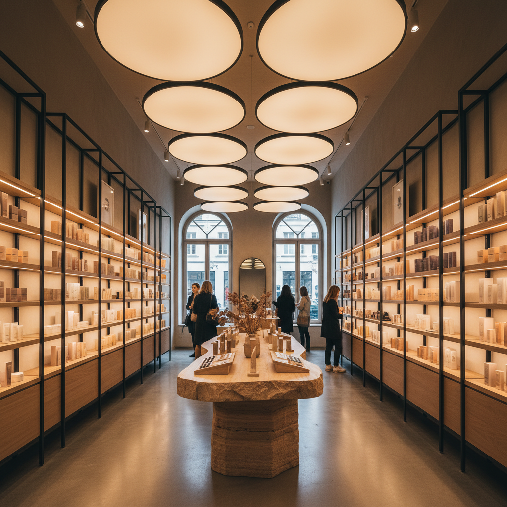
Aurore Fragrance
Brand Identity · Campaign Direction · Packaging
"A century-old perfumier launching its first direct-to-consumer line needed a visual language that honored French craft heritage without suffocating in nostalgia."
Challenge
Compete with €300 designer fragrances at €80 retail without looking mass-market.
Insight
The buyer isn't purchasing scent — they're purchasing the memory of a place they've never been.
Territory
Romantic realism: real hands, real light, real materials — but elevated to a dream state.
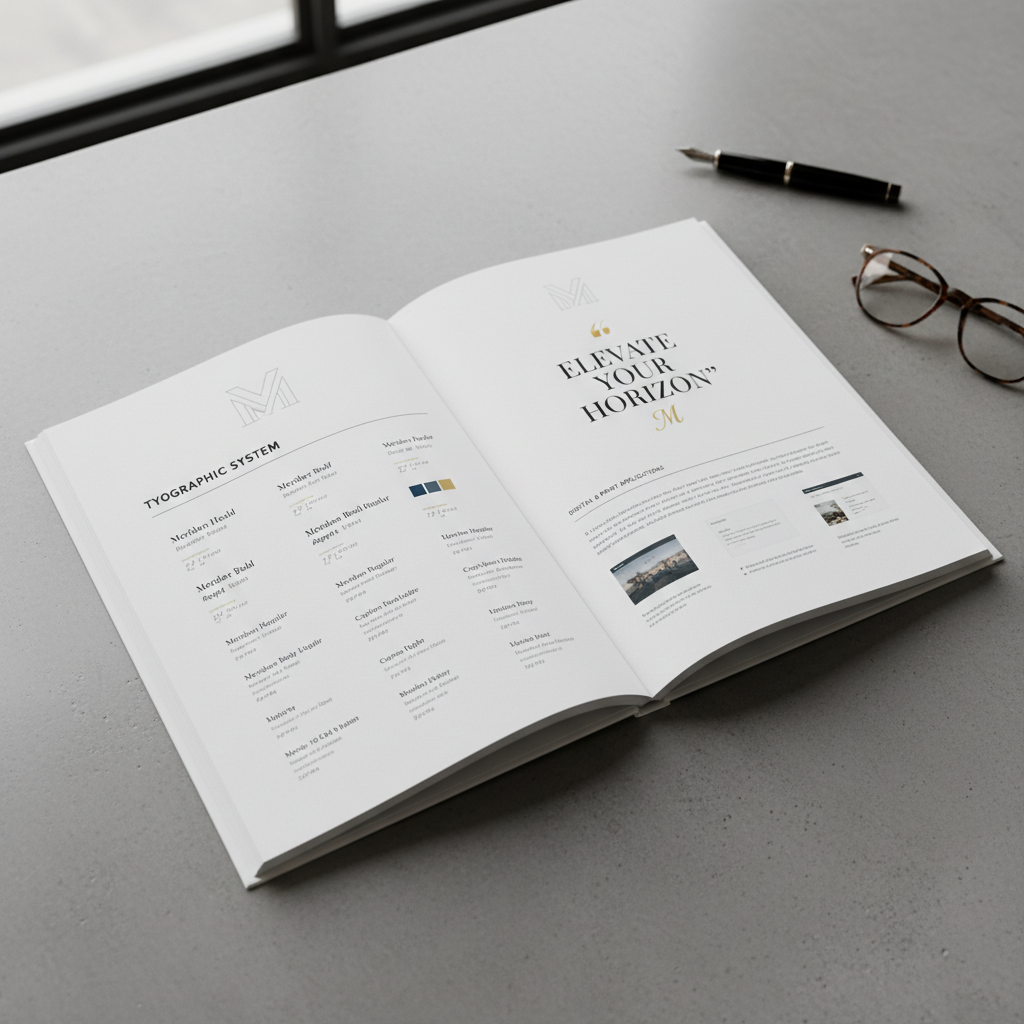
The typeface choice — a 1920s grotesque revived for digital — created the temporal tension at the core of the brand: unmistakably old, completely contemporary. Every layout decision amplified this productive contradiction.
Full process documentation available
72 pages. Sketches through final system.
Voss didn't just design our brand — she built the logic that will govern every decision we make for the next decade. The thinking is as beautiful as the work.
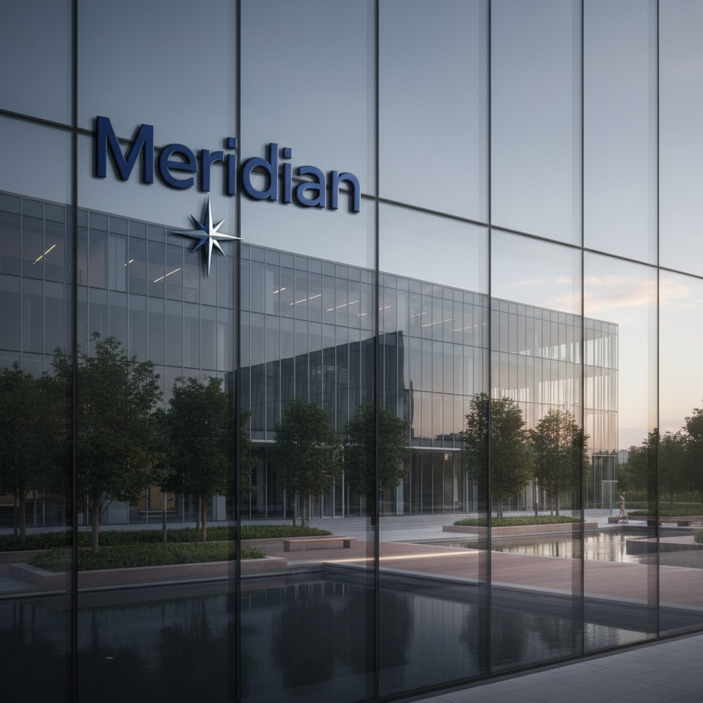
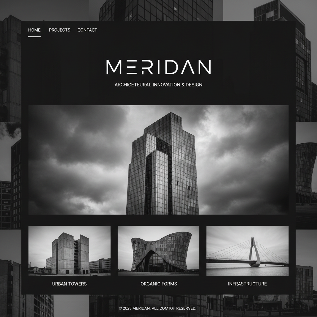
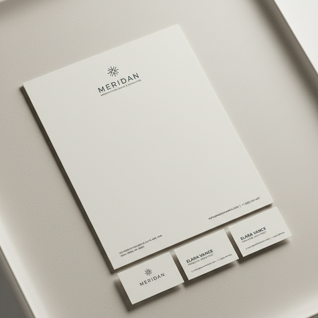
Meridian Studio
Brand Architecture · Motion Identity · Digital System
"A Brazilian architecture practice winning international commissions needed a brand system that could hold the weight of a 40-year portfolio while signaling that the most ambitious work was still ahead."
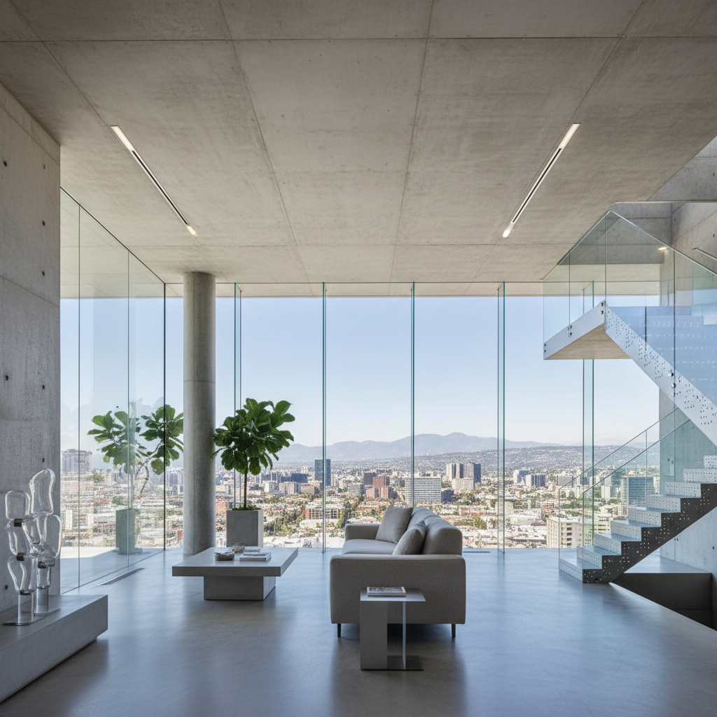
The motion identity became the brand's most powerful differentiator. A logotype that assembles itself — each letter arriving from its architectural origin point — communicated both the firm's process and its precision in a single three-second moment.
Challenge
A firm known for buildings, invisible as a brand.
Insight
Architecture is time made spatial. The identity needed to embody duration.
Territory
Structural minimalism: every element load-bearing, nothing decorative.
Full process documentation available
88 pages. Brand architecture through motion guidelines.
We've won three international awards since the rebrand. Every shortlisted entry credits the visual identity. That's what great direction does — it makes the work undeniable.
Tell me what you're building.
Senior creative available for brand foundations, campaign direction, and visual systems. Currently booking Q3 2026.